commercial truck marketplace
We created a newly refreshed information architecture and typography system that provided better access to content and enabled users to perform more effectively and efficiently.
Role: UX Design Lead + Product Development
The secondary goal was to create a more contemporary aesthetic via fresh typography, bold imagery, and soft textures.
Homepage - Desktop
Search Results - Desktop
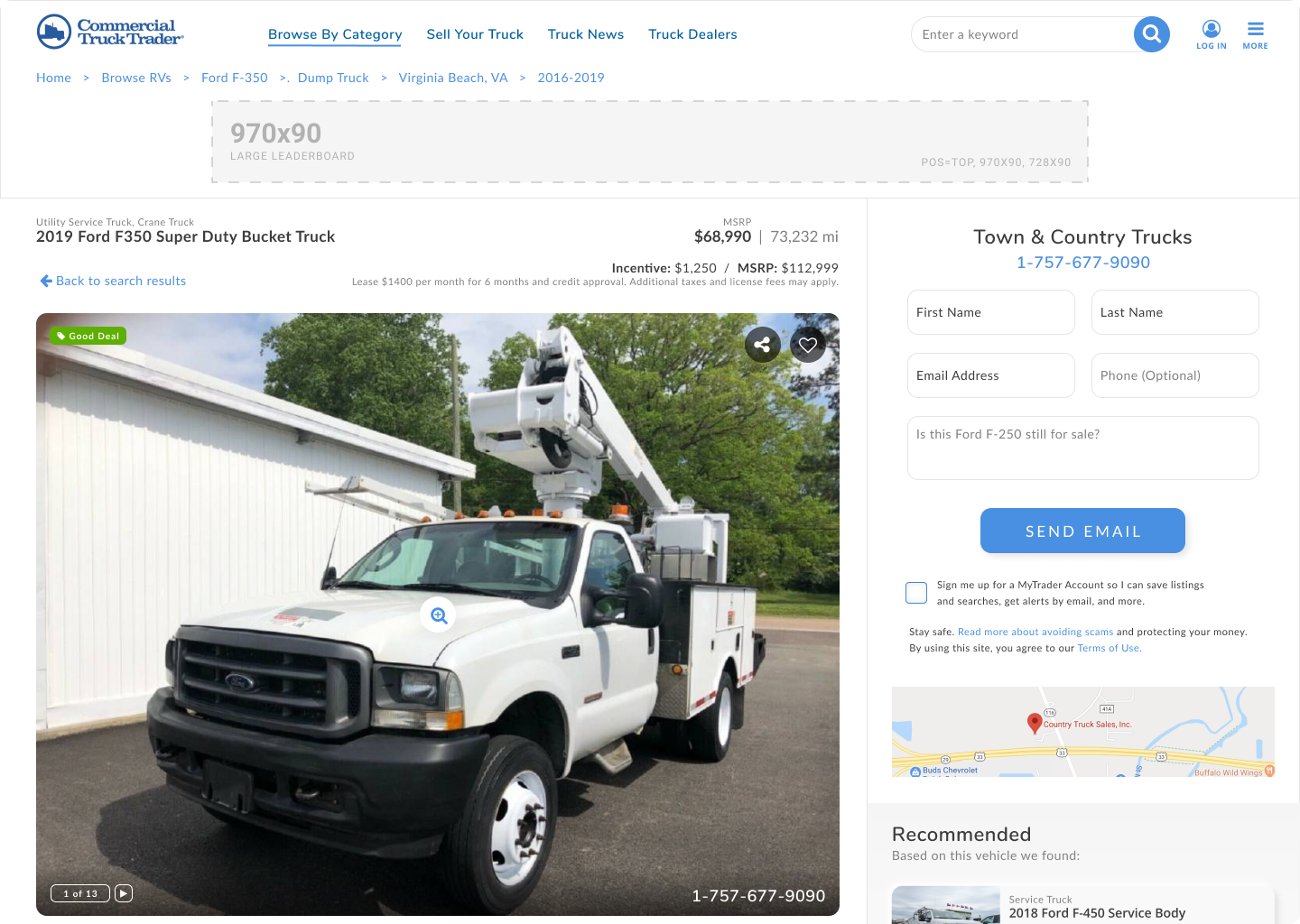
Detail Page - Desktop
the process
-
Understand business and user needs
-
Data analysis, user interviews, Hotjar, and other 3rd party feedback.
-
First steps toward potential solutions
-
Review, test, and assess feedback
-
Deploy, analyze behavior, optimize, and monitor KPIs
process details
We interviewed users to establish where the pain points were and to uncover any gaps or missing functionality users expected.
We analyzed user behavior through funnel metrics and user interaction data.
We aligned with stakeholders, explained our analysis, discussed solutions, and prioritized efforts. We developed an optimization strategy from there.
We diagrammed user flows to improve or alleviate pain points in the user funnel.
We iterated on those user flows further and then wireframed several possible solutions.
We reviewed our wireframes and user flows with stakeholders and adjusted them as needed.
We built a visual prototype we could put in front of users.
We conducted several user interviews to test our prototype and gather feedback to reveal any blind spots or unwanted behavior.
We iterated on the prototype design until we were confident.
We worked with our development team to get a pixel-perfect update into production.
Once live, we evaluated performance, reviewed KPIs and began A/B testing to optimize our solution further.
the results
Overall the user satisfaction was positive and we successfully improved the user experience by several measures.
We had an increase in overall lead conversion of nearly 25%
Our search results to detail page conversion rose significantly.
Our search result impressions increased.

Homepage Search - Mobile

Popular Browse - Mobile

Type Browse - Mobile

Search Result - Mobile

Detail Page - Mobile

Sell Page - Mobile


